Green Lake Wayfinding System

Timeframe: January 2021 - March 2021
Tools: Adobe Illustrator, Photoshop, Procreate
Challenge:
Green Lake Park’s wayfinding system has become dated and has fallen into disrepair. A redesign is needed to reflect Seattle’s current park patrons.
Green Lake Park’s wayfinding system has become dated and has fallen into disrepair. A redesign is needed to reflect Seattle’s current park patrons.
Solution:
To continue the Olmstead legacy of showcasing Green Lake’s natural beauty, the redesign is a visually-accessible, family-friendly identity system and experience that guides park-goers through the park’s natural attractions. By merging historic landmarks, local flora and fauna, and a friendly slab serif that reflects the industrious advances of the early Seattle 1900s, Green Lake Park’s wayfinding redesign is timelessly friendly and approachable.
To continue the Olmstead legacy of showcasing Green Lake’s natural beauty, the redesign is a visually-accessible, family-friendly identity system and experience that guides park-goers through the park’s natural attractions. By merging historic landmarks, local flora and fauna, and a friendly slab serif that reflects the industrious advances of the early Seattle 1900s, Green Lake Park’s wayfinding redesign is timelessly friendly and approachable.

Research:
Each year, Green Lake Park records over a million visitors on its grounds, mostly from locals looking to relax and partake in its many recreational activities. Since its development in the early 1900s, public and private funding has enabled Green Lake Park to remain a getaway destination for all people across generations, many of which introduce the park to their children. Aside from the natural weathering of the signage, Green Lake has always faced issues with its wayfinding system, parting being inaccessible to children and the visually impaired.
Since the Olmsted Plan in early 1900s, Green Lake has been extensively monitored with the intention to create a recreational space for the people of Seattle. Human-interaction has been both detrimental and beneficial for the lake ecosystem, but continued efforts in researching and conserving the area has kept the lake mostly healthy over the years.
Process:
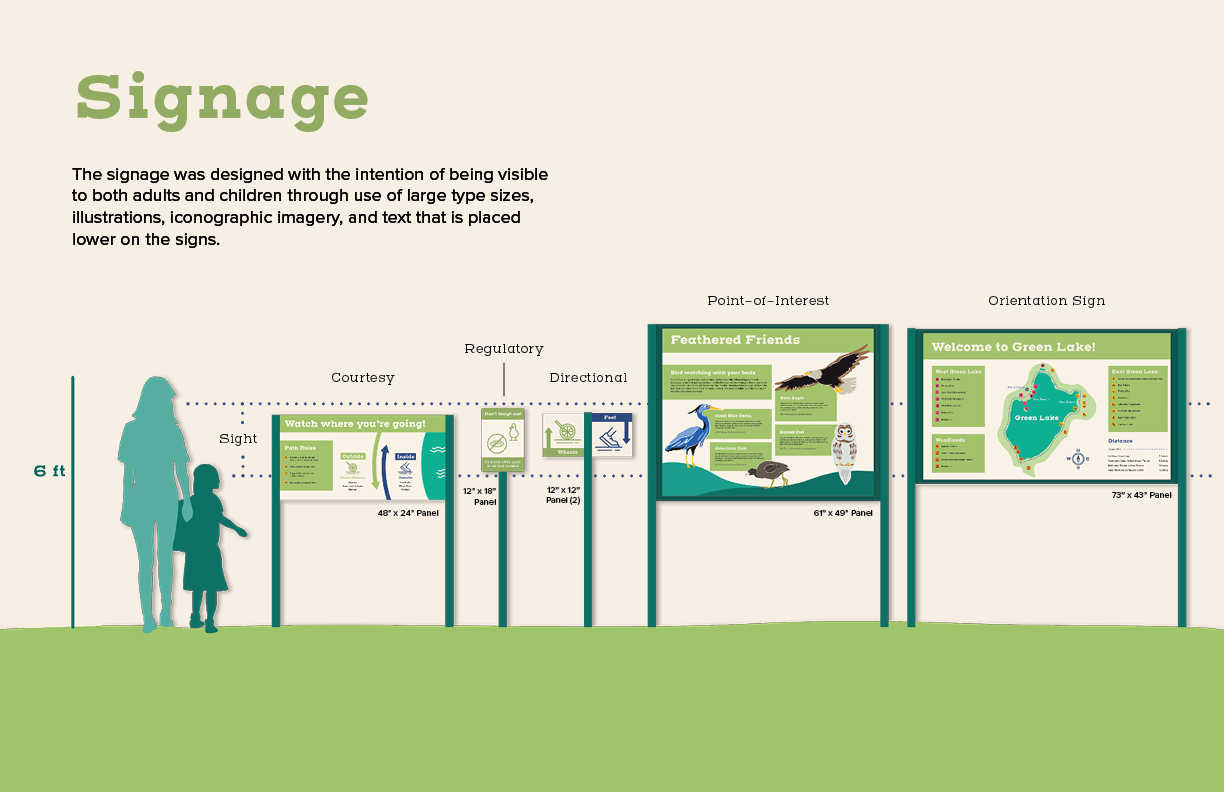
In designing the system, attention was put on identifying a slab-serif typeface that could be industrious yet friendly to reflect the working-class patron history of the park and its new generation of frequenters. The typeface would also be readable at a variety of distances. Henderson slab reflected those goals, and thus a set of icons showcasing the amenities and activities was modeled after the slabs to form a unified visual system.


As the maps and interest boards began to finish, I worked on regulatory and directionals signs that could be strategically placed in the sight-line of most viewers. These pieces were ideally completed with little to no copy and universally understood.


Outcome:
Through iteration, I found how important it was to design for audience/user ability. While I intended for the wayfinding systems to be interesting to families with young children, I needed to balance what kids might think of as fun, which generally came across as more bright and chaotic, with things that were accessible, that of which can be readable and legible in differing scenarios.
In that regard, the project was a successful redesign, not only in making the park more interactive through bird-finding and placemaking but also with communicating information graphically.