Third Place Books Rebrand
Every story has a setting.
Collaborators: Erika Morales
Tools: InDesign, Illustrator, Photoshop, After Effects, XD, Procreate
Challenge:
Third Place Books is an enchanting bookstore that caters to it’s neighborhood-based Seattle audiences. Despite their loyal following, they lack a consistent visual identity that exists across their branches and literary programs geared towards young adults and teens.
Third Place needs a visual narrative that can show its knowledge and commitment to books, while also helping customers find a cozy spot to gather in their neighborhood branches.
Solution:
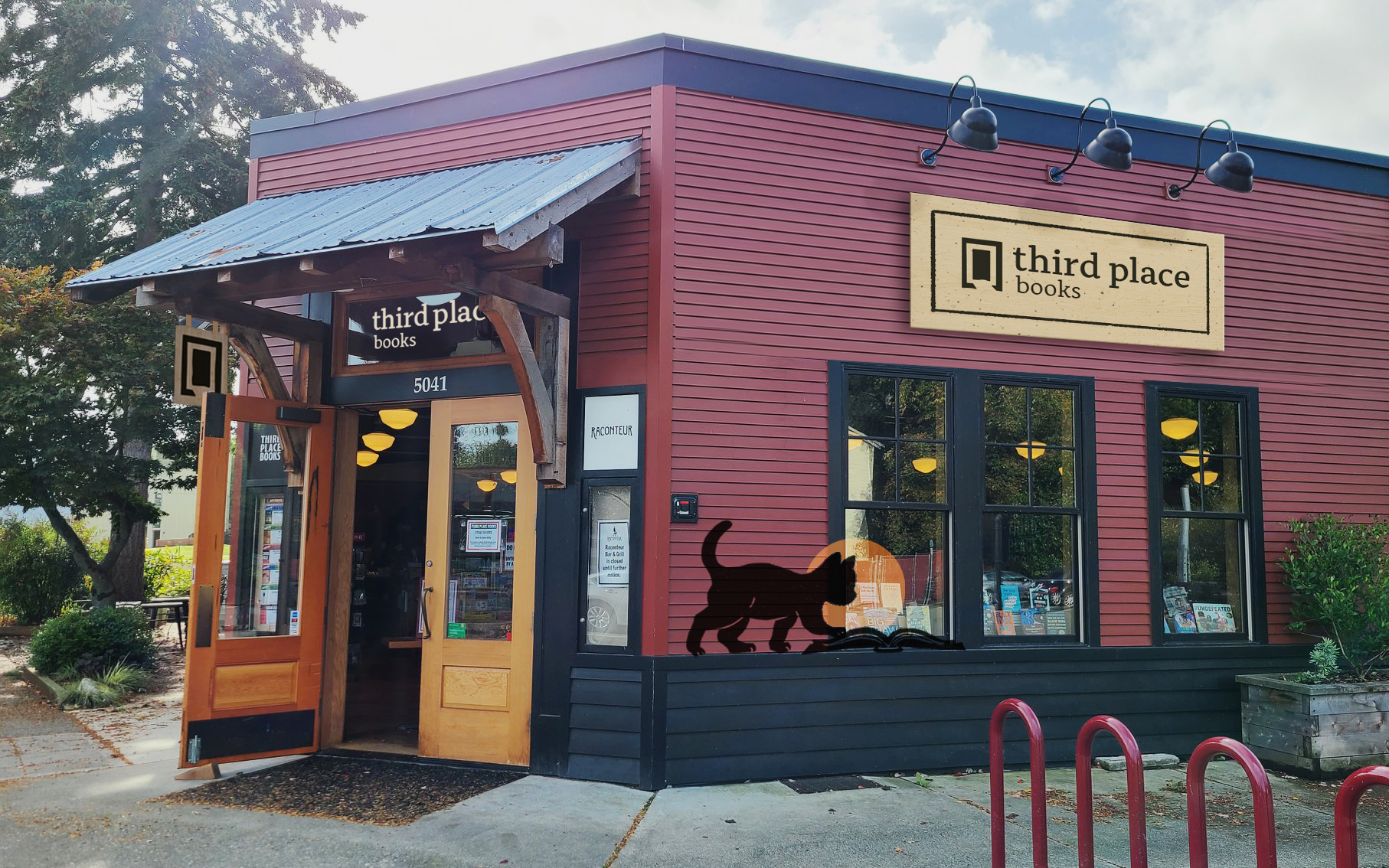
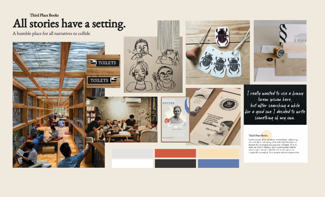
Our concept “Every story has a setting” was a way to unify yet individualize the look of each neighborhood’s branch as well as visually represent Third Place Book’s brand character: down-to-earth, community focused, and eclectic. From the storefronts we chose to showcase to custom, linocut style illustrations, every detail showcased Third Place Books sense of welcoming community.
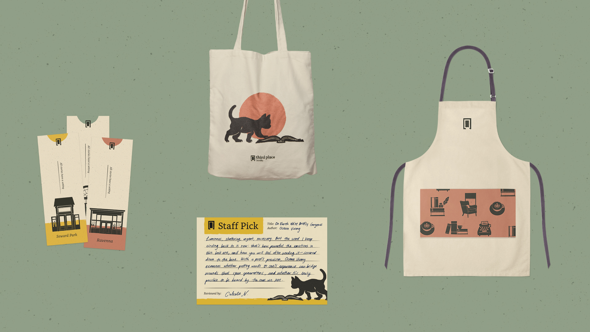
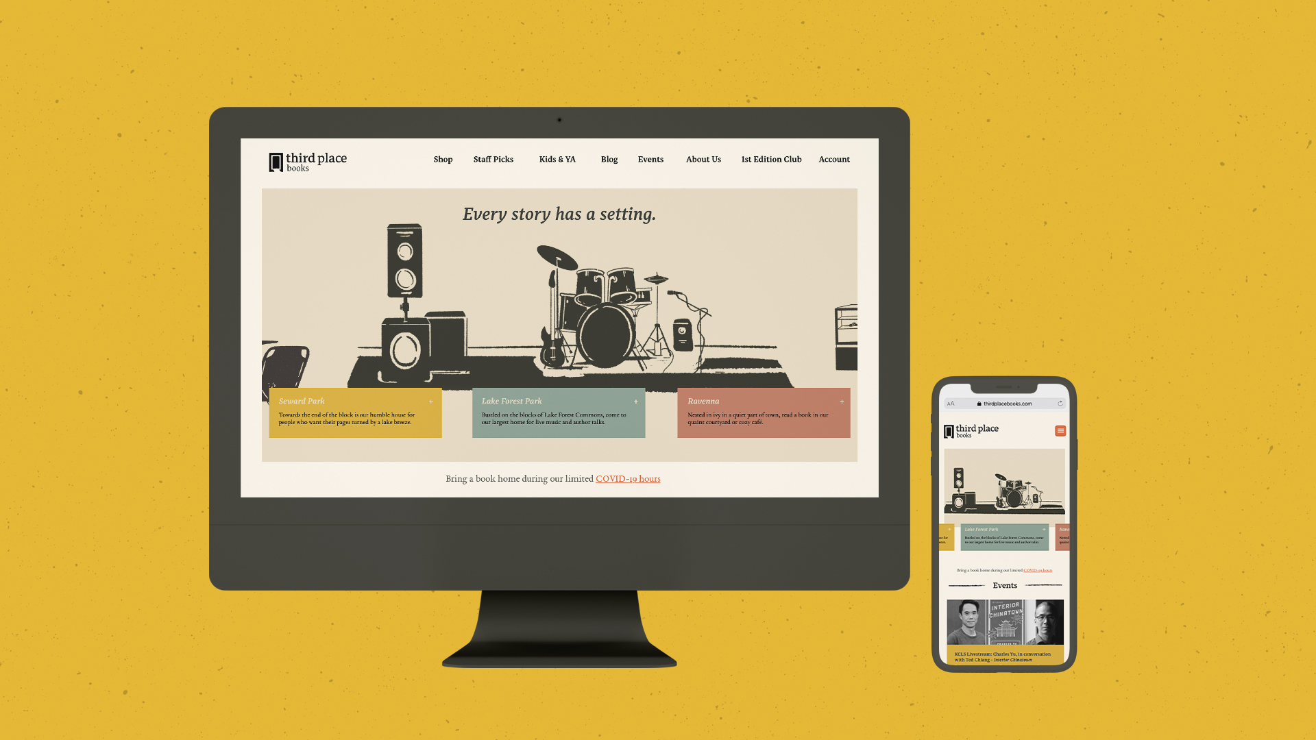
Deliverables include logo and illustrations applied on signage, book bags, bookmarks, staff stationary, promotional posters, a dynamic website, and social media graphics.
Our concept “Every story has a setting” was a way to unify yet individualize the look of each neighborhood’s branch as well as visually represent Third Place Book’s brand character: down-to-earth, community focused, and eclectic. From the storefronts we chose to showcase to custom, linocut style illustrations, every detail showcased Third Place Books sense of welcoming community.
Deliverables include logo and illustrations applied on signage, book bags, bookmarks, staff stationary, promotional posters, a dynamic website, and social media graphics.

Research & Demographics:
Third Place Books opened its first branch in Lake Forest Park, Washington with the intent of providing communal spaces for neighborhood residents to bond over knowledge, information, and books. As they expanded their reacher in the past 30 years, Third Place has opened 2 additional bookstores, all with their own amenities catered towards each location. For example, the Ravenna branch provides a casual cafe to accommodate their prevalently high school following, whereas Seward Park contains a restaurant with a full bar to accommodate its older, generally wealthier residents.
Notably, workers expressed the company’s intent to not expand the locations further to focus on high quality service to the locals.
The Process:
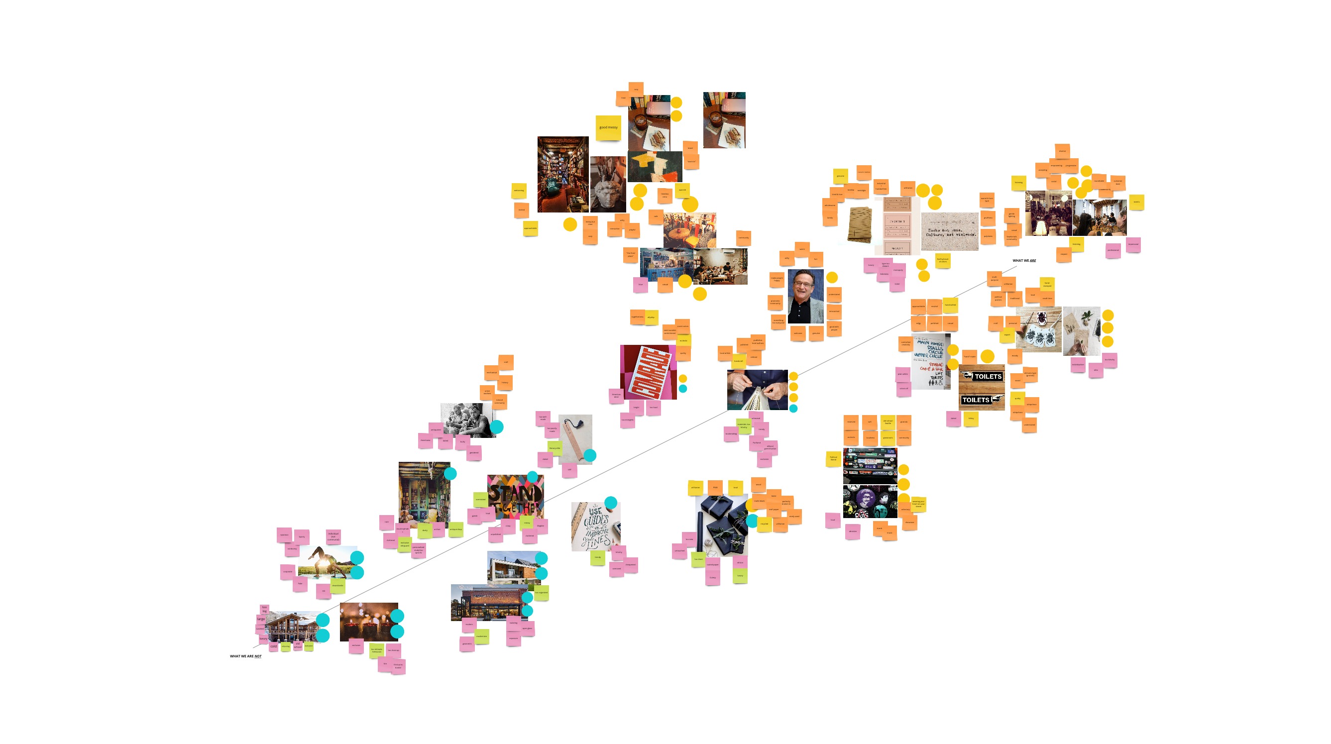
We started with an audit of their marketing and social media, store layout and assets, website information, and interviews of staff and regular customers. After collating all of our materials, we established Third Place Book’s Mission, Positioning, Promise and Brand Character.
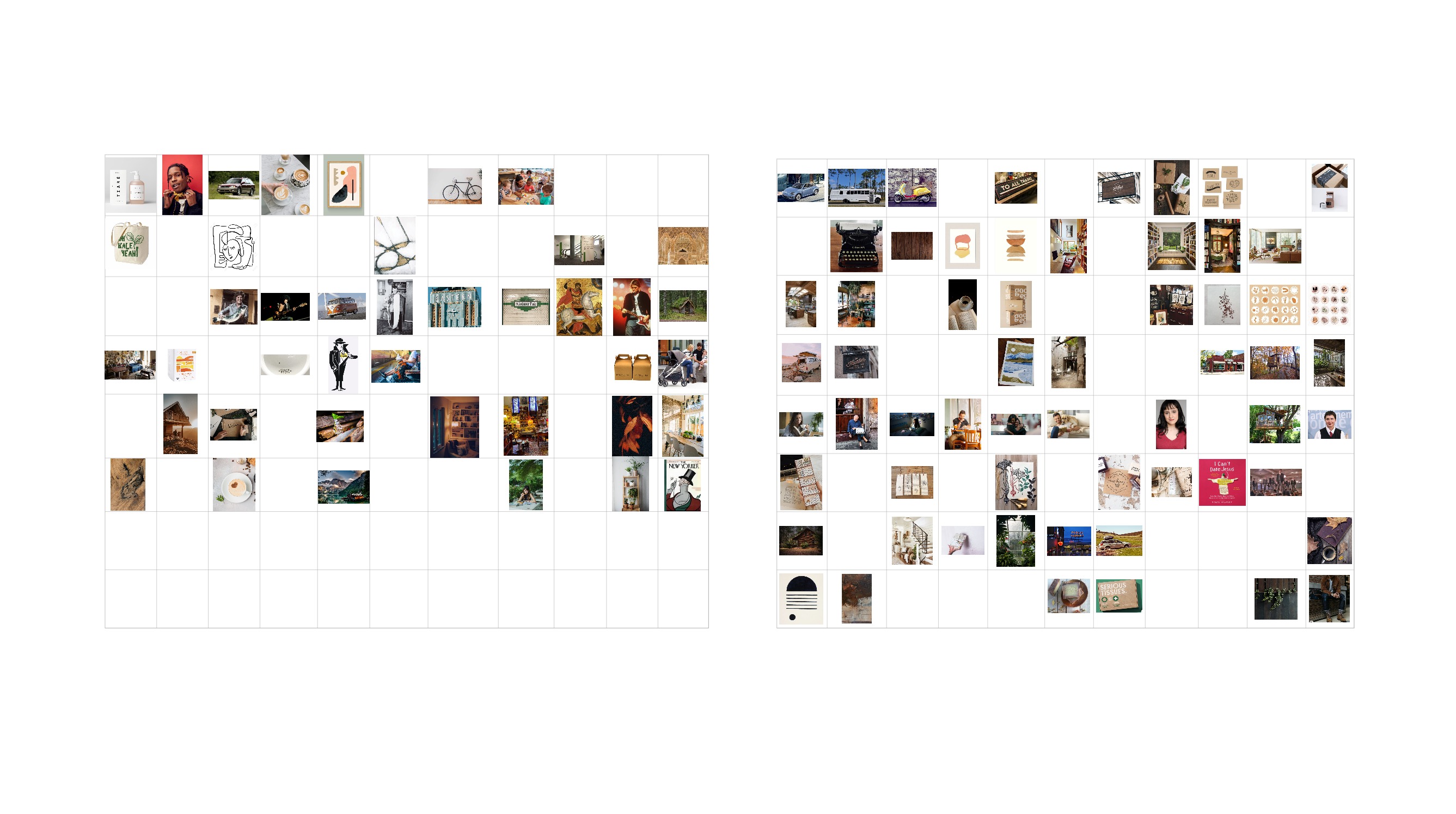
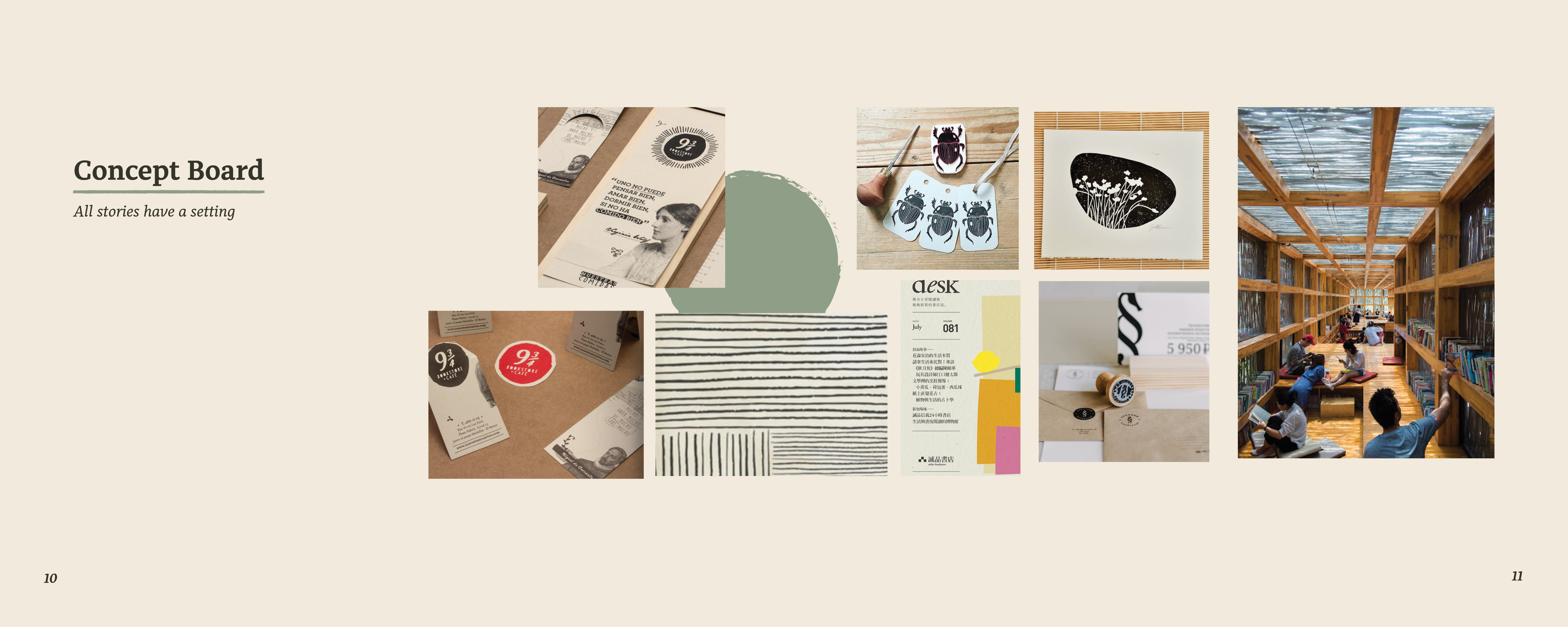
After a few brainstorming sessions, we developed our concept, “Every story has a setting” and proceeded to build out a mood board which captured the brand character.
![]()
![]()
![]()
![]()
![]()
After building out the initial moodboard, determining brand values, and establishing a visual tone, we began to build out the assets and elements that would embody the visual identity. Below is an overview of the guidelines established in our brand book.
![]()
![]()
![]()
![]()
![]()
![]()
![]()
![]()
As we began building out our first assets, we started with the intention of creating a door and a bookmark as a metaphoric logo about the beginning of a journey. This initially put a heavy emphasis on hand-touched illustrations that were inspired by children’s illustrations. This became an integral part of the identity where we realized the logo needed to emphasize the hand-touched elements to connect with the community, down-to-earth characteristics of the rebrand.
![]()
In order to differentiate ourselves and lean into Third Place Books’ business approach, we began to design around helping users make their own decision about which branch asset is most impactful for bringing folks out. Consequently, we adjusted the designs to include illustrations of relevant locations within the store. We illustrated the setting elements for novel-savvy customers to create a nuanced, nostalgic journey with copy content focused around bringing folks out to shop and relax.
We started with an audit of their marketing and social media, store layout and assets, website information, and interviews of staff and regular customers. After collating all of our materials, we established Third Place Book’s Mission, Positioning, Promise and Brand Character.
After a few brainstorming sessions, we developed our concept, “Every story has a setting” and proceeded to build out a mood board which captured the brand character.
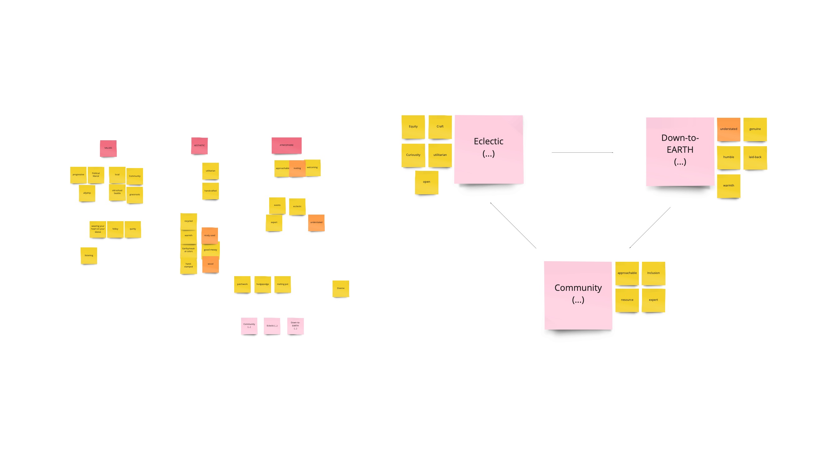
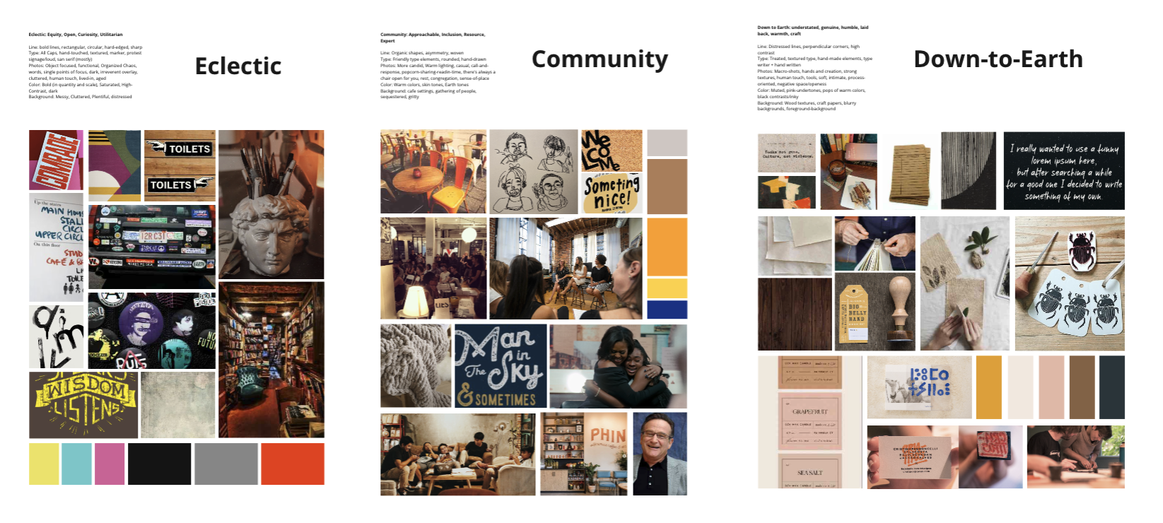
After building out the initial moodboard, determining brand values, and establishing a visual tone, we began to build out the assets and elements that would embody the visual identity. Below is an overview of the guidelines established in our brand book.

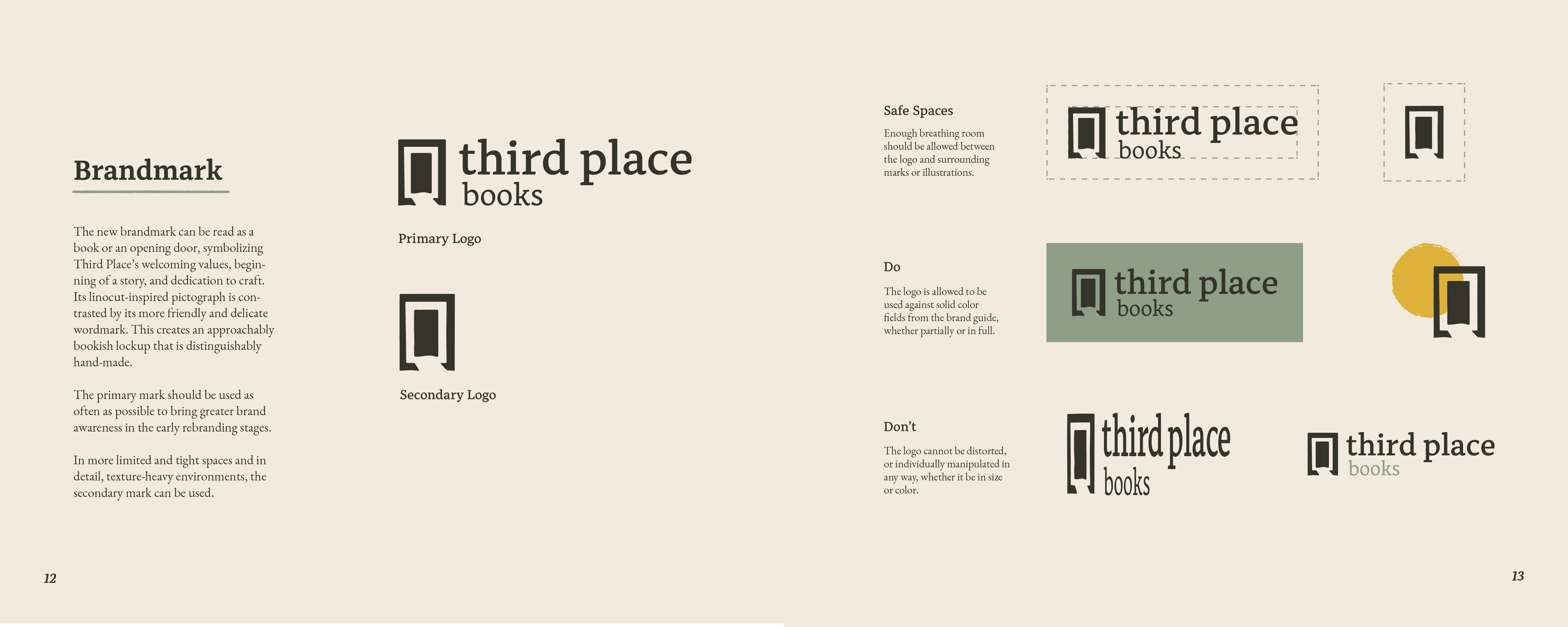


As we began building out our first assets, we started with the intention of creating a door and a bookmark as a metaphoric logo about the beginning of a journey. This initially put a heavy emphasis on hand-touched illustrations that were inspired by children’s illustrations. This became an integral part of the identity where we realized the logo needed to emphasize the hand-touched elements to connect with the community, down-to-earth characteristics of the rebrand.
In order to differentiate ourselves and lean into Third Place Books’ business approach, we began to design around helping users make their own decision about which branch asset is most impactful for bringing folks out. Consequently, we adjusted the designs to include illustrations of relevant locations within the store. We illustrated the setting elements for novel-savvy customers to create a nuanced, nostalgic journey with copy content focused around bringing folks out to shop and relax.


Third Place sets itself apart through
community programming and leisurely spaces
Success:
This story’s happy ending centers around designing a timeless illustrated brand that can attract dedicated and casual book-lovers to their unique branches and events. In an increasingly saturated digital and delivery-based Seattle market, Third Place sets itself apart through community programming and leisurely spaces that can be imagined through the brand before entering the store spaces.