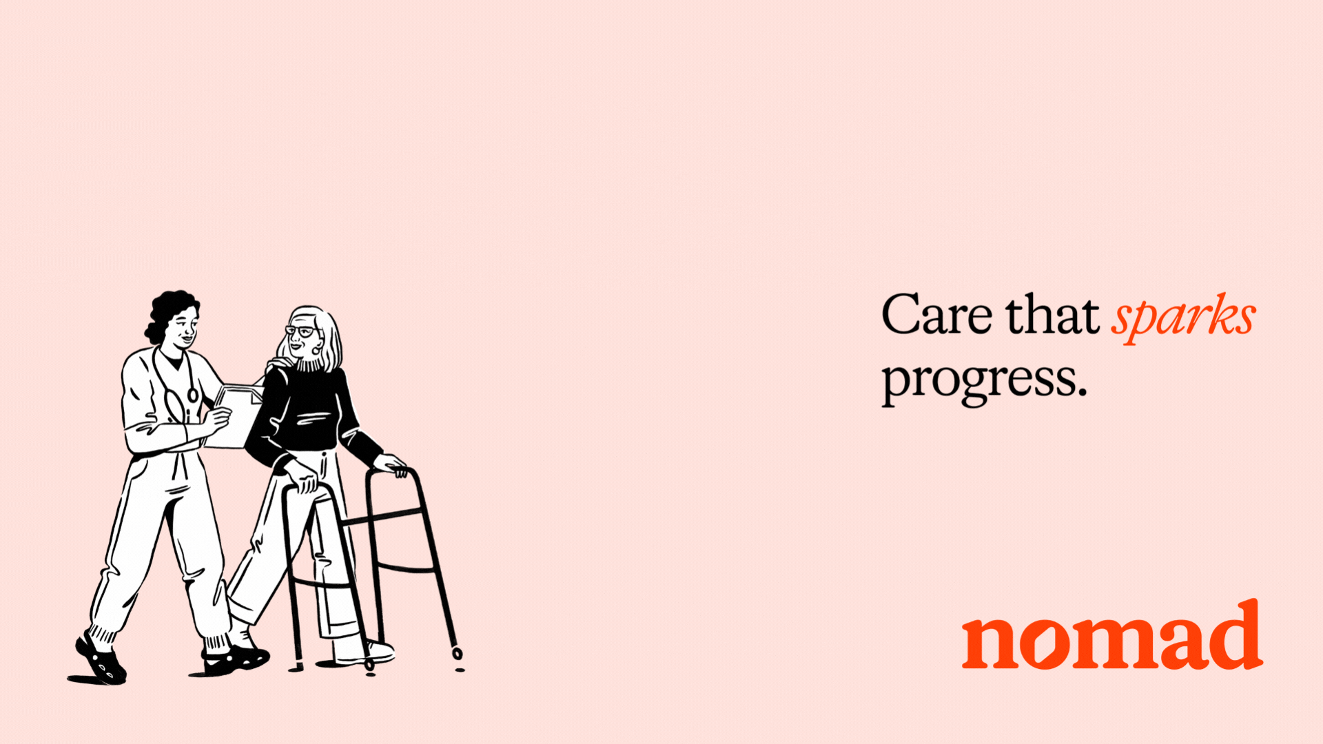
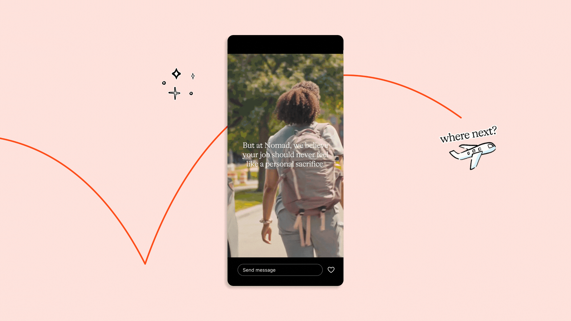
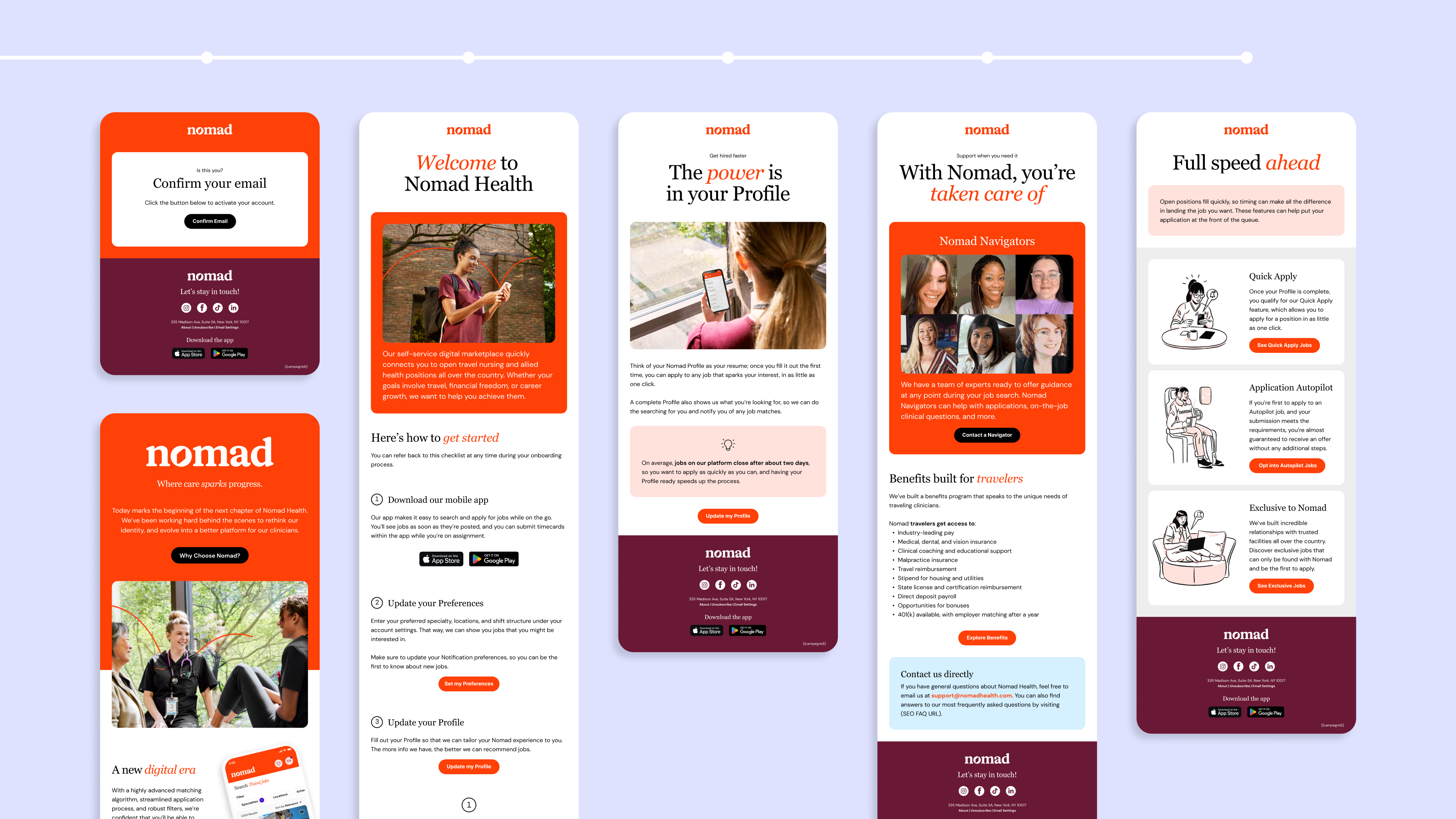
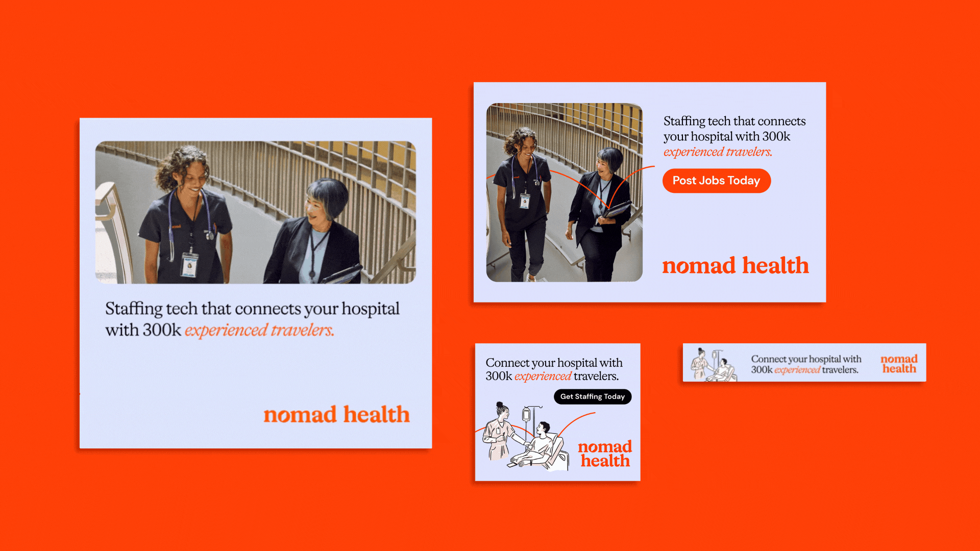
Nomad Health Rebrand
Time Frame: April 2023 - October 2023
Tools: InDesign, Illustrator, Photoshop, Figma, After Effects, Canva, Premiere Pro
Nomad Health is an online staffing marketplace that connects clinicians to healthcare jobs. As a brand designer, I worked in the in-house marketing team creating visual and motion assets across website, social media, ads, emails, presentations, and product launches/updates. By maintaining brand guidelines, I was able to scale design efforts on cross-functional teams including product & engineering, internal communications, B2B marketing, and lifecycle marketing.
![]()
![]()
![]()
![]()
![]()
![]()
![]()
Other key achievements:
Because of NDA, please reach out directly to view a detailed case study of my work. In the meantime, you can also view my live rebrand of the website here, or view some of my organic social media here.


Other key achievements:
- Launching a rebrand by defining visual design guidelines. I helped adapt brand touch-points by collaborating with marketers, copywriters, and engineers and documented changes for long-term alignment.
- Defining UI and visual design requirements for the digital marketing design system, and redefining components to improve alignment between native design system.
- Animating and illustrating various media across social media, website, and mobile app, resulting in increased user engagement and acquisition.
- Designing and testing B2B ads, thereby increasing C-suite audience engagement.
- Re-designing and developing various email journeys in collaboration with lifecycle marketing including onboarding, referrals, and job digests.
- Curating stock photography, retouching photos, and editing videos.
Because of NDA, please reach out directly to view a detailed case study of my work. In the meantime, you can also view my live rebrand of the website here, or view some of my organic social media here.
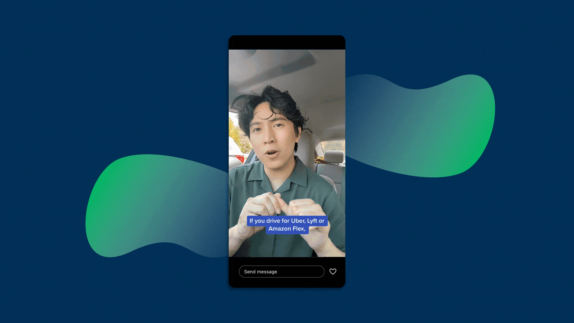
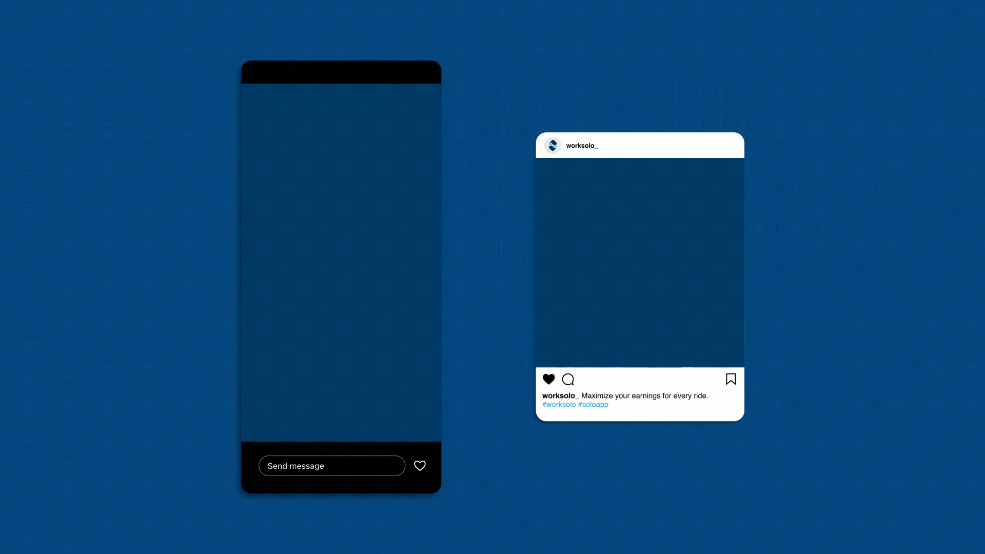
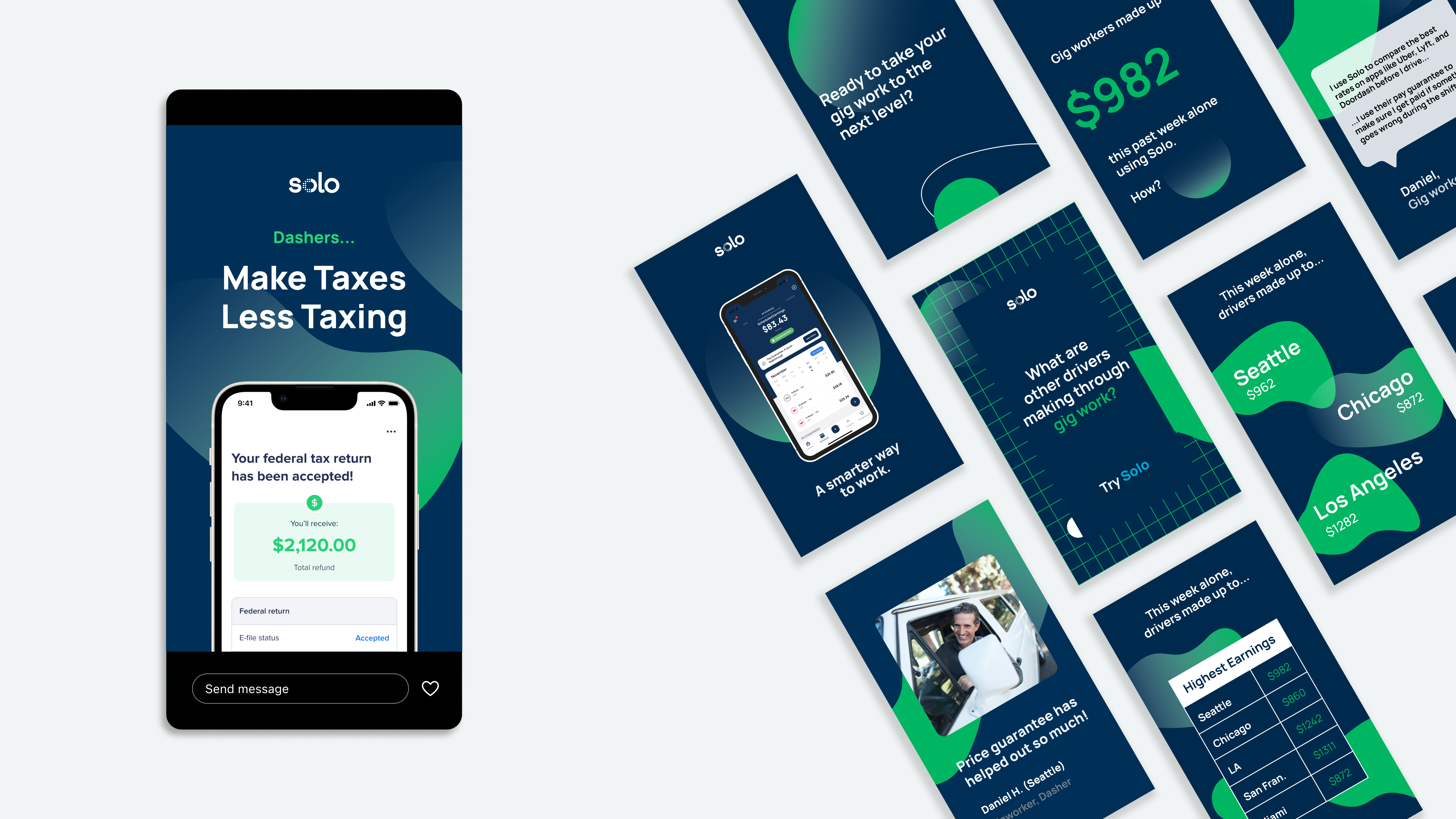
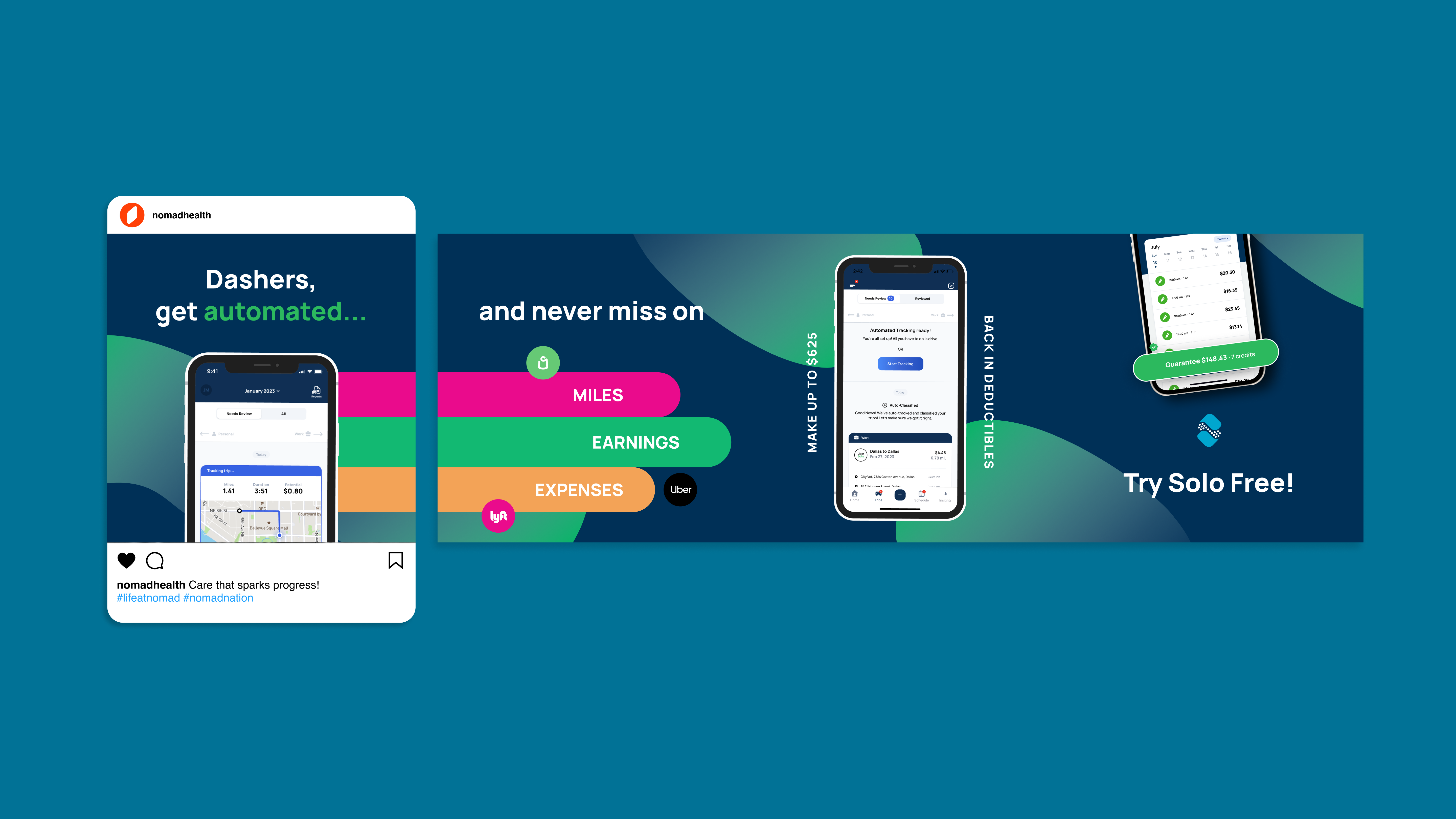
Solo App Marketing

Guarenteed pay for gig work.
Role: Digital DesignerGuarenteed pay for gig work.
Time Frame: November 2022 - June 2023
Tools: Figma, Illustrator, Photoshop, After Effects
Solo is a financial technology startup helping gig workers and independent business owners achieve financial stability by providing them with tools and data to maximize their earnings. As a digital designer, I reported to the Growth Manager and Community Manager to increase customer reach and retention.
![]()
![]()
![]()
![]()
![]()
As a designer, my tasks and achievements include:
Currently my work in under NDA, please reach out directly to get a detailed case study or deliverables.

As a designer, my tasks and achievements include:
- Align marketing assets to product’s design system
- Designing original paid social media content
- Storyboard, edit, and film short-form video for Tiktok and Reels
- Design email campaigns
- Manage and develop brand assets
- Work with the marketing team to develop strategies for outreach
Currently my work in under NDA, please reach out directly to get a detailed case study or deliverables.
Third Place Books Rebrand
Every story has a setting.
Collaborators: Erika Morales
Tools: InDesign, Illustrator, Photoshop, After Effects, XD, Procreate
Challenge:
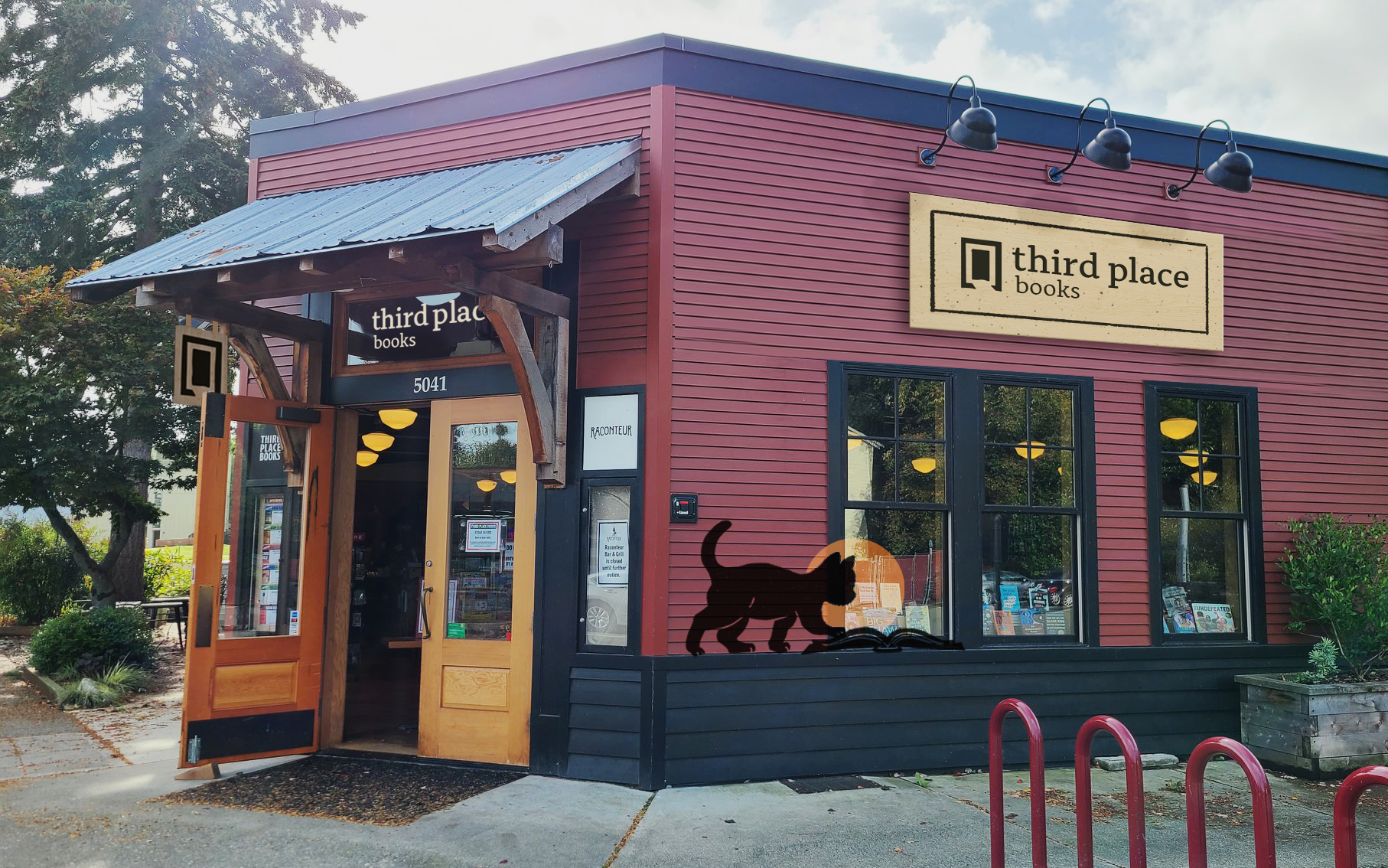
Third Place Books is an enchanting bookstore that caters to it’s neighborhood-based Seattle audiences. Despite their loyal following, they lack a consistent visual identity that exists across their branches and literary programs geared towards young adults and teens.
Third Place needs a visual narrative that can show its knowledge and commitment to books, while also helping customers find a cozy spot to gather in their neighborhood branches.
Solution:
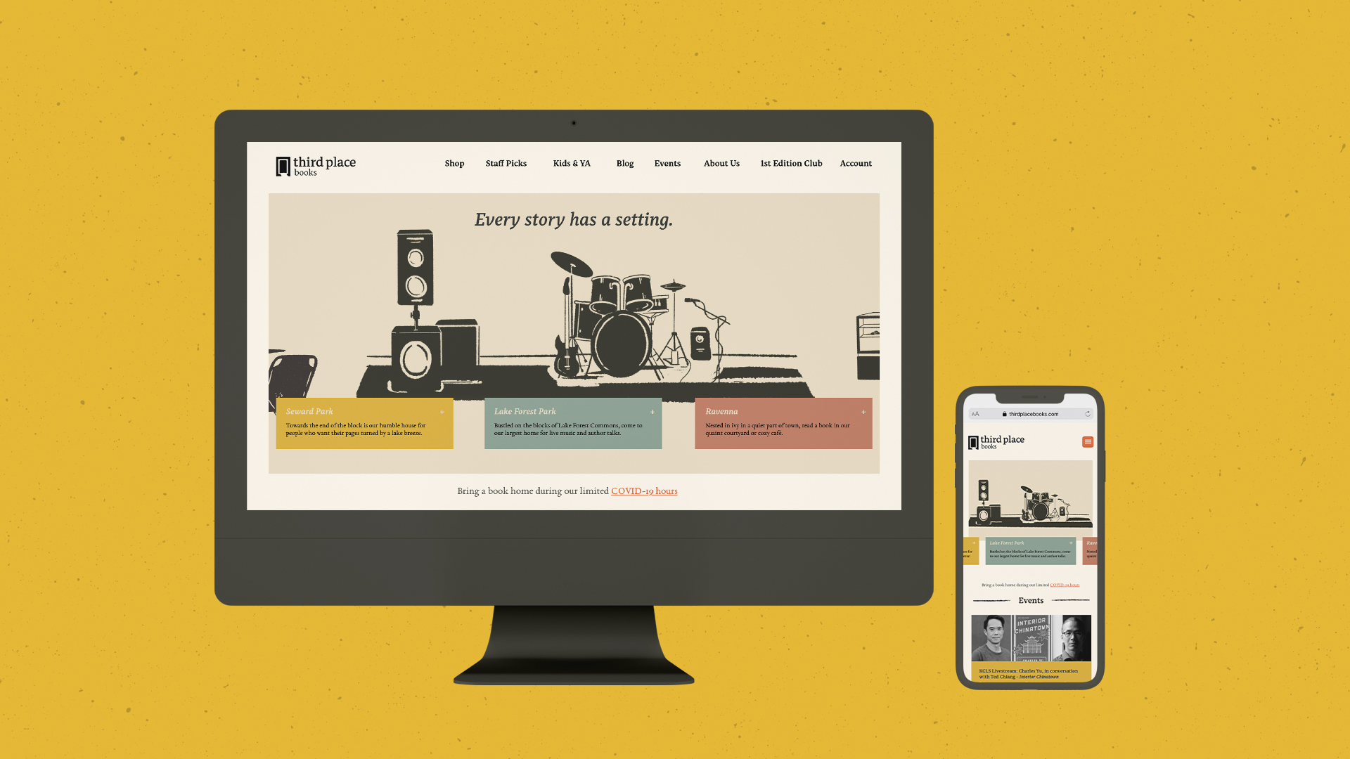
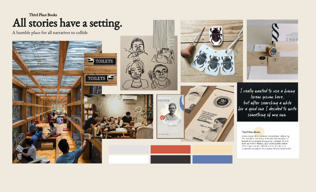
Our concept “Every story has a setting” was a way to unify yet individualize the look of each neighborhood’s branch as well as visually represent Third Place Book’s brand character: down-to-earth, community focused, and eclectic. From the storefronts we chose to showcase to custom, linocut style illustrations, every detail showcased Third Place Books sense of welcoming community.
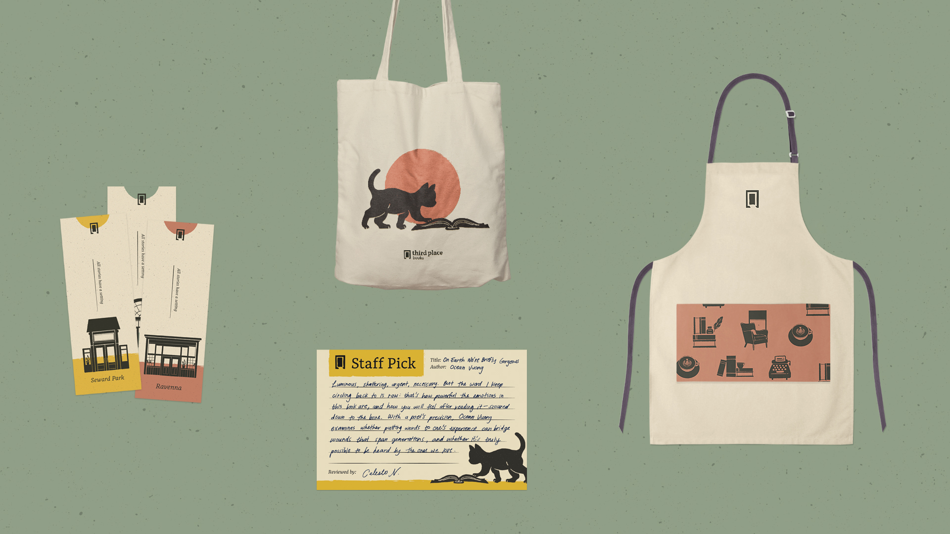
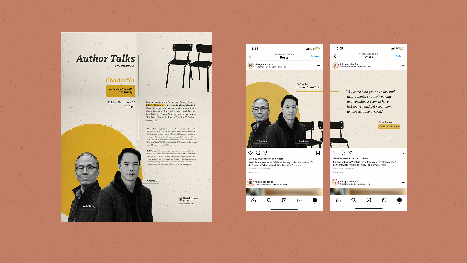
Deliverables include logo and illustrations applied on signage, book bags, bookmarks, staff stationary, promotional posters, a dynamic website, and social media graphics.
Our concept “Every story has a setting” was a way to unify yet individualize the look of each neighborhood’s branch as well as visually represent Third Place Book’s brand character: down-to-earth, community focused, and eclectic. From the storefronts we chose to showcase to custom, linocut style illustrations, every detail showcased Third Place Books sense of welcoming community.
Deliverables include logo and illustrations applied on signage, book bags, bookmarks, staff stationary, promotional posters, a dynamic website, and social media graphics.
Research & Demographics:
Third Place Books opened its first branch in Lake Forest Park, Washington with the intent of providing communal spaces for neighborhood residents to bond over knowledge, information, and books. As they expanded their reacher in the past 30 years, Third Place has opened 2 additional bookstores, all with their own amenities catered towards each location. For example, the Ravenna branch provides a casual cafe to accommodate their prevalently high school following, whereas Seward Park contains a restaurant with a full bar to accommodate its older, generally wealthier residents.
Notably, workers expressed the company’s intent to not expand the locations further to focus on high quality service to the locals.
The Process:
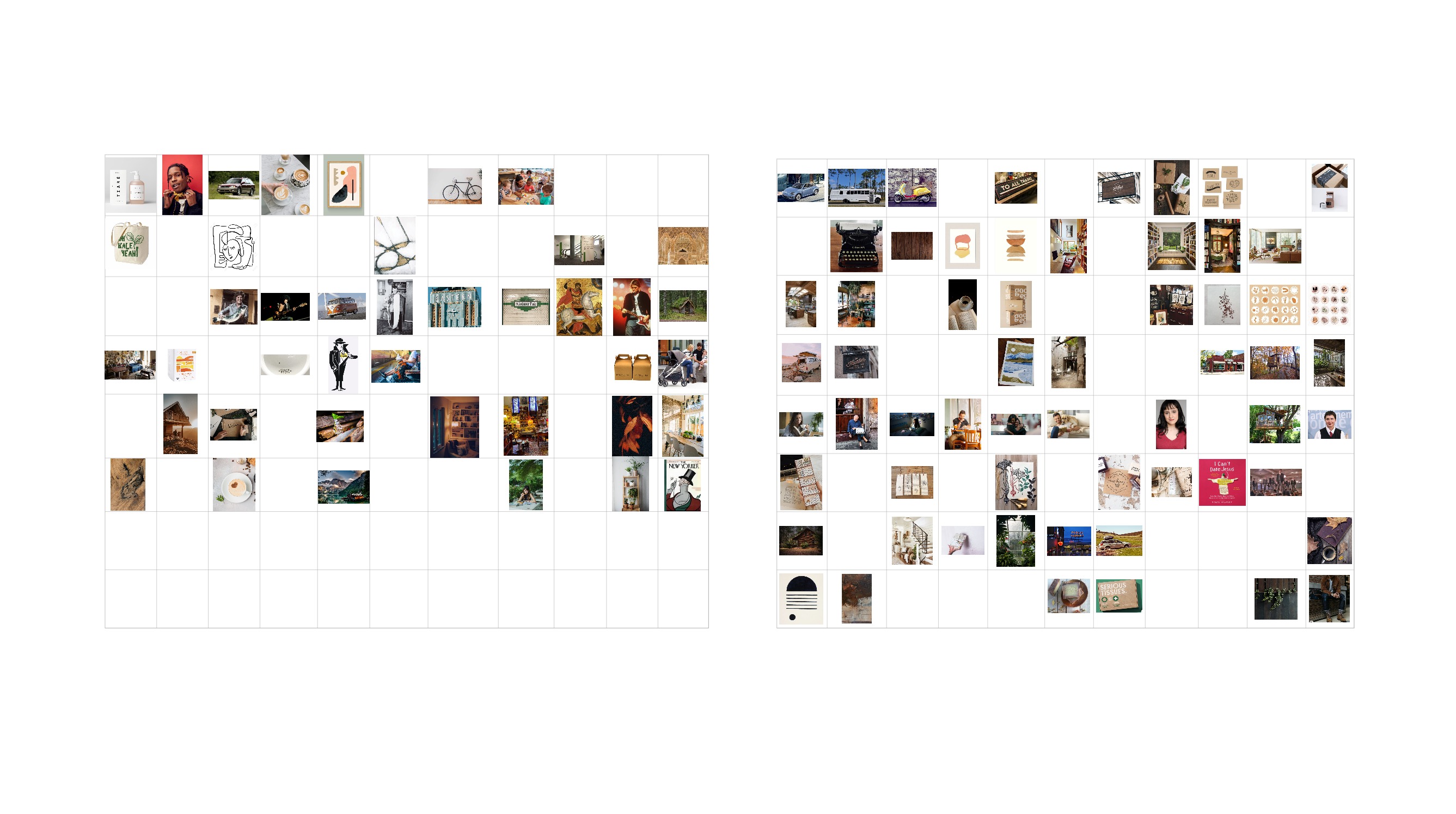
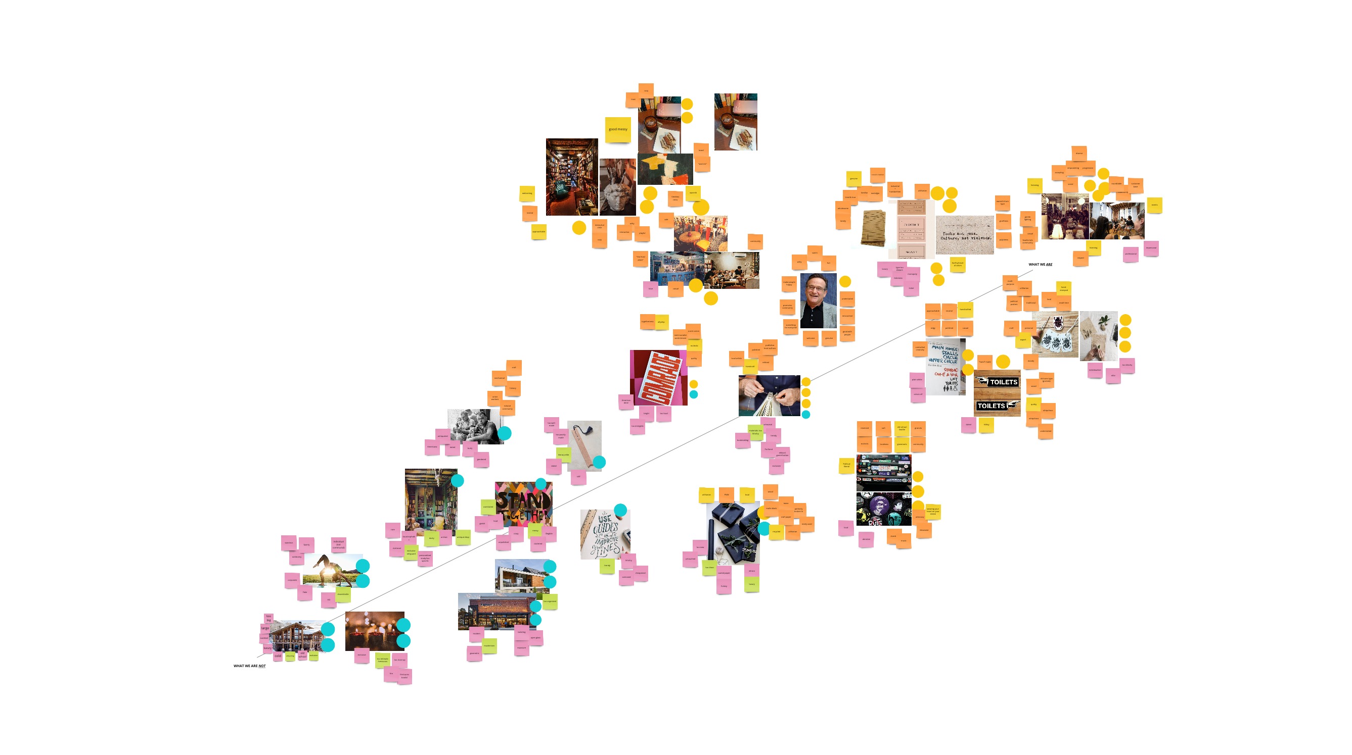
We started with an audit of their marketing and social media, store layout and assets, website information, and interviews of staff and regular customers. After collating all of our materials, we established Third Place Book’s Mission, Positioning, Promise and Brand Character.
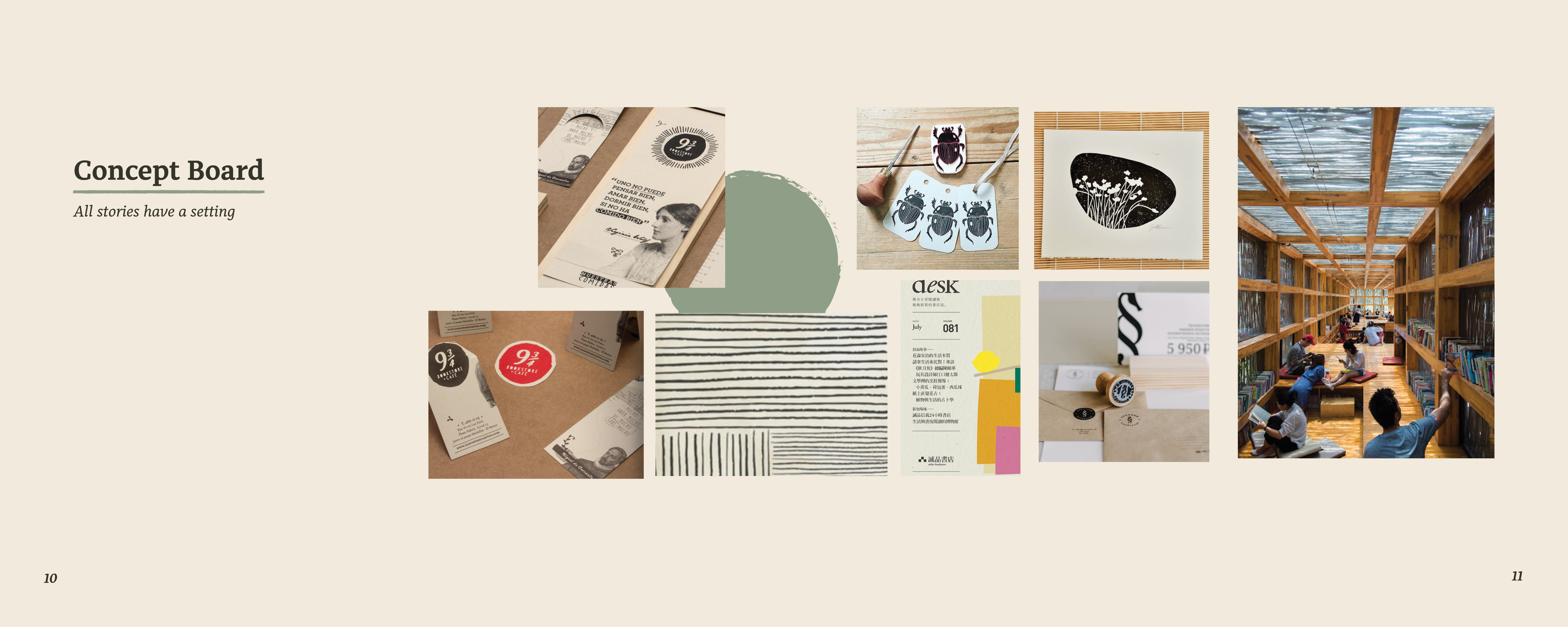
After a few brainstorming sessions, we developed our concept, “Every story has a setting” and proceeded to build out a mood board which captured the brand character.
![]()
![]()
![]()
![]()
![]()
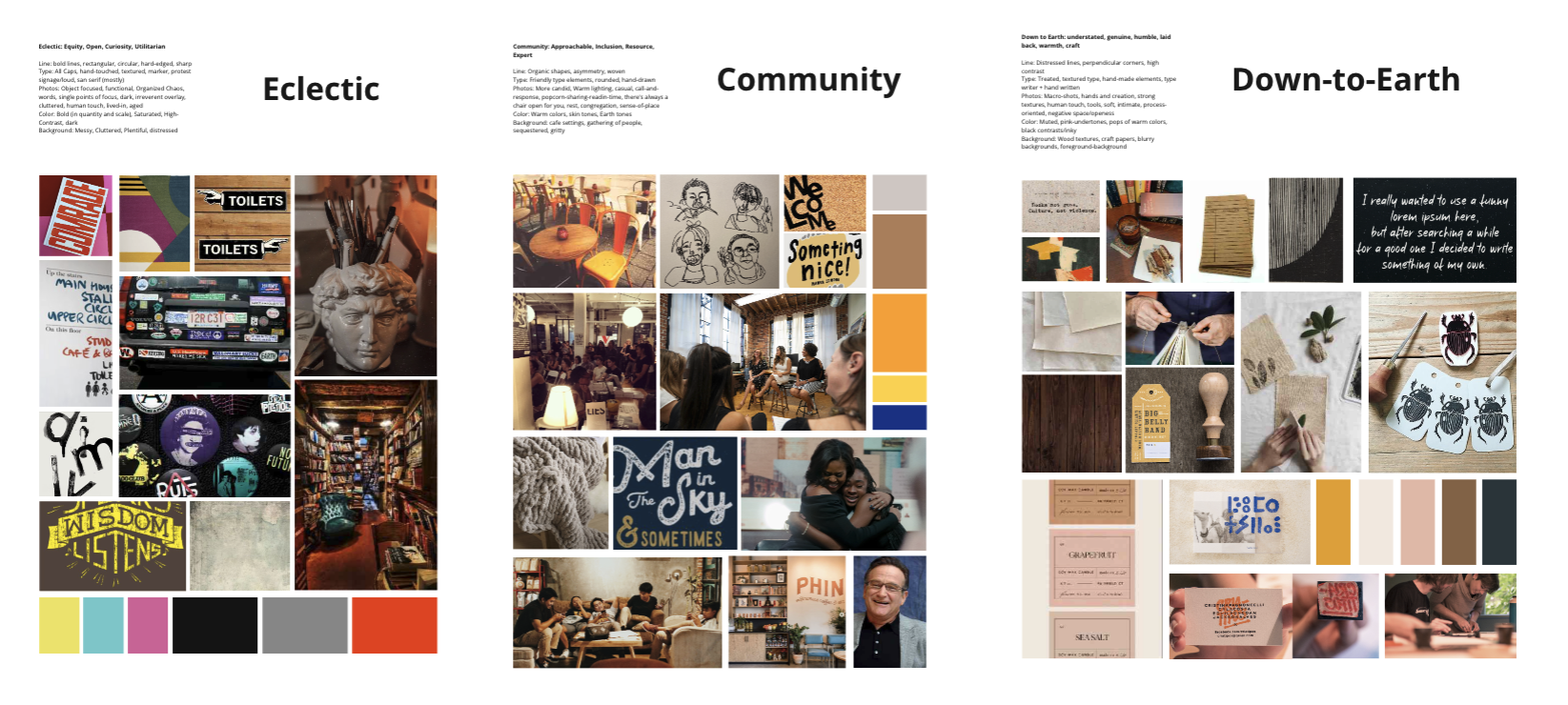
After building out the initial moodboard, determining brand values, and establishing a visual tone, we began to build out the assets and elements that would embody the visual identity. Below is an overview of the guidelines established in our brand book.
![]()
![]()
![]()
![]()
![]()
![]()
![]()
![]()
As we began building out our first assets, we started with the intention of creating a door and a bookmark as a metaphoric logo about the beginning of a journey. This initially put a heavy emphasis on hand-touched illustrations that were inspired by children’s illustrations. This became an integral part of the identity where we realized the logo needed to emphasize the hand-touched elements to connect with the community, down-to-earth characteristics of the rebrand.
![]()
In order to differentiate ourselves and lean into Third Place Books’ business approach, we began to design around helping users make their own decision about which branch asset is most impactful for bringing folks out. Consequently, we adjusted the designs to include illustrations of relevant locations within the store. We illustrated the setting elements for novel-savvy customers to create a nuanced, nostalgic journey with copy content focused around bringing folks out to shop and relax.
We started with an audit of their marketing and social media, store layout and assets, website information, and interviews of staff and regular customers. After collating all of our materials, we established Third Place Book’s Mission, Positioning, Promise and Brand Character.
After a few brainstorming sessions, we developed our concept, “Every story has a setting” and proceeded to build out a mood board which captured the brand character.
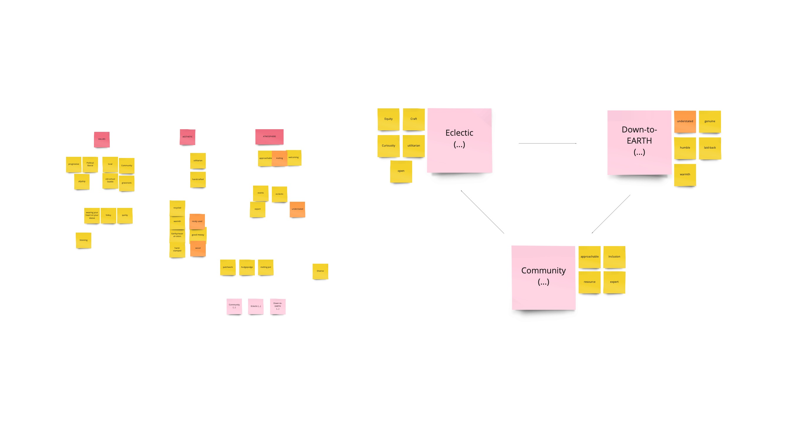
After building out the initial moodboard, determining brand values, and establishing a visual tone, we began to build out the assets and elements that would embody the visual identity. Below is an overview of the guidelines established in our brand book.

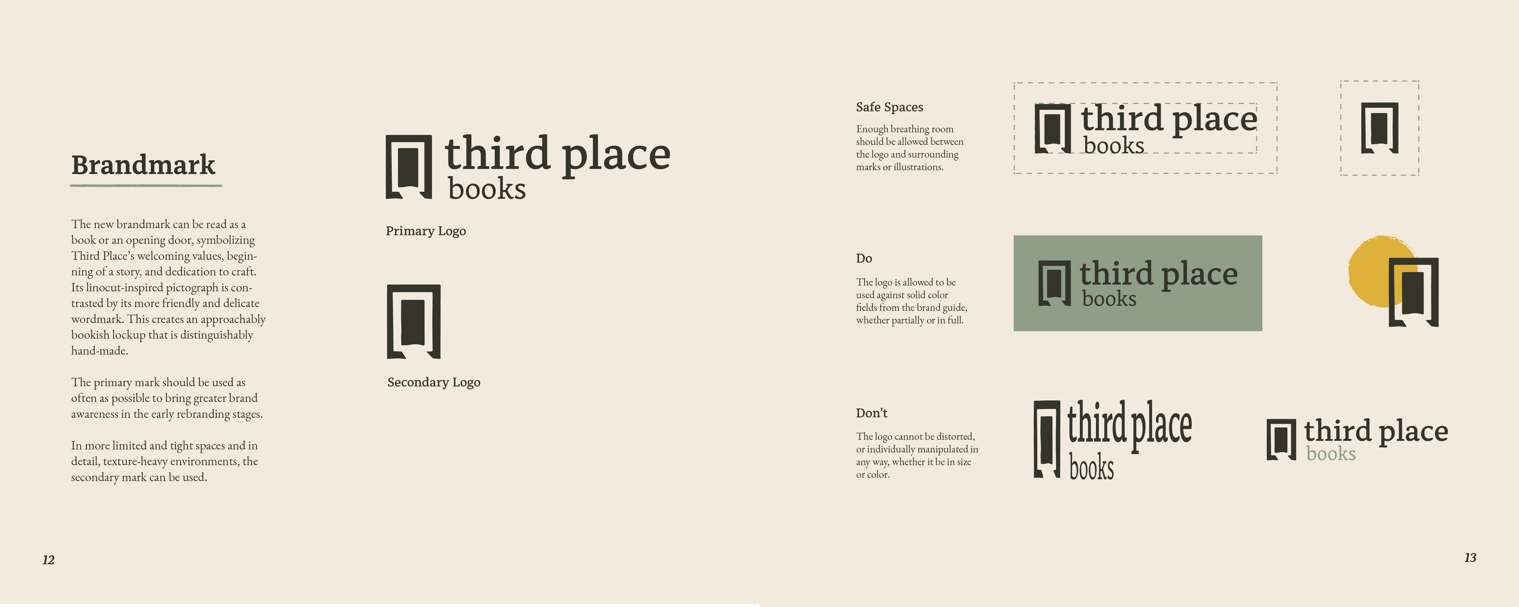


As we began building out our first assets, we started with the intention of creating a door and a bookmark as a metaphoric logo about the beginning of a journey. This initially put a heavy emphasis on hand-touched illustrations that were inspired by children’s illustrations. This became an integral part of the identity where we realized the logo needed to emphasize the hand-touched elements to connect with the community, down-to-earth characteristics of the rebrand.
In order to differentiate ourselves and lean into Third Place Books’ business approach, we began to design around helping users make their own decision about which branch asset is most impactful for bringing folks out. Consequently, we adjusted the designs to include illustrations of relevant locations within the store. We illustrated the setting elements for novel-savvy customers to create a nuanced, nostalgic journey with copy content focused around bringing folks out to shop and relax.

Third Place sets itself apart through
community programming and leisurely spaces
Success:
This story’s happy ending centers around designing a timeless illustrated brand that can attract dedicated and casual book-lovers to their unique branches and events. In an increasingly saturated digital and delivery-based Seattle market, Third Place sets itself apart through community programming and leisurely spaces that can be imagined through the brand before entering the store spaces.
Santé Wine Service
Fine wining for a new
generation of drinkers.
Time Frame: September 2020 - December 2020
Collaborators: An Bui, Seth Marney
Tools: Adobe XD, Illustrator, Photoshop
Challenge:
How can we make the wine purchasing experience less intimidating for a social drinkers?
Goal:
Design a fine wining experience for a new generation of drinkers that is less stuffy and intimidating.
Solution:
Santé is a direct-to-customer wine retailer catered to the casual wine drinker. To make that happen, Santé is designed as a subscription wine service paired with a mobile application that teaches the user how to drink wine, while collecting data that will help predict the user’s next catered wine experience delivered each month.
Research:
Our team conducted a survey of adults around the Greater-Seattle area to get an understanding of their needs and concerns about wine. From our survey, we asked about general drinking habits, occasions when surveyees might drink wine, and surveyees hesitations around choosing or drinking wine.
In general, audiences suited for our service were working adults aged 21-35 split into 2 personas based on our surveys of roughly 50 participants.
Competitor Audit:
Next we compared similar wine subscription and delivery services. One of the major insights from this exercise was that many wine services provide tasting notes, but those notes tend to be geared toward seasoned wine drinkers. Every wine service provided a quantitative ranking for wines, but rarely would they be able to provide the context for a newer wine drinker what might appeal to them.
Brainstorming:
We dove primarily into defining ideal drinking experiences and educational models. After finding most of our demographics were comprised of social drinkers, we found the best way to revitalize Santé was to offer wine parties with each subscription box including guided tasting notes.
When reviewing our findings, we found that:
1. The number one reason for drinking wine (in our data set) is for social scenarios
2. Delivery and direct-to-consumer wine is on the rise
3. Most new wine drinkers are intimidated by wine due to not wanting to waste money for poor taste.
Synthesizing those findings, our team decided to make Santé a subscription wine service that allows you to learn about and drink wine with your friends.
Userflow:
I was responsible for creating the digital experience for having “wine parties” to help educate and drink with friends. The task flow below was created with the intention to focus on the business as a whole, with the wine party flow acting as the primary driver for a minimum viable product.

Wireframes:
The team went through two rounds of review of my wireframes with a testing session in the middle. Below is an initial overview of the key userflow.

Through our testing we found user were confused by the amount of information being presented on our tasting screen, so we separated the information onto their own pages in a carousel format to reduce cognitive overload and to streamline the tasting process.

Furthermore, we tested different was to visualize and describe the body of wine.
Hi-fidelity Mockups:
After completing our intial usability tests, I began to build the UI and apply the patterns. In the screen below, you will notice that a full quiz-based onboarding was added to help our AI determine the first initial order for wine. We then proceeded to look at invite layouts to develop an event-sharing and planning feature to fulfill our social aspects.

Finally, we designed our own tasting system for first time users to properly drink wine. This would also show what is in each box, while prompting users to quickly provide instant feedback.

Next Steps:
Through my exploration of this service, some things I would like to further explore are:
- Ways to remove friction with the referral service. As it stands, invitations and referrals are all done natively, but I wonder if providing SMS text messages would remove potential friction.
- Building a more robust connection from the OOBE to the digital wine party. In early explorations we mapped out only to assume a card insert with a QR-code would be enough.
- Designing a shopping/commerce page and see how tasting notes will affect the user experience.
Green Lake Wayfinding System

Timeframe: January 2021 - March 2021
Tools: Adobe Illustrator, Photoshop, Procreate
Challenge:
Green Lake Park’s wayfinding system has become dated and has fallen into disrepair. A redesign is needed to reflect Seattle’s current park patrons.
Green Lake Park’s wayfinding system has become dated and has fallen into disrepair. A redesign is needed to reflect Seattle’s current park patrons.
Solution:
To continue the Olmstead legacy of showcasing Green Lake’s natural beauty, the redesign is a visually-accessible, family-friendly identity system and experience that guides park-goers through the park’s natural attractions. By merging historic landmarks, local flora and fauna, and a friendly slab serif that reflects the industrious advances of the early Seattle 1900s, Green Lake Park’s wayfinding redesign is timelessly friendly and approachable.
To continue the Olmstead legacy of showcasing Green Lake’s natural beauty, the redesign is a visually-accessible, family-friendly identity system and experience that guides park-goers through the park’s natural attractions. By merging historic landmarks, local flora and fauna, and a friendly slab serif that reflects the industrious advances of the early Seattle 1900s, Green Lake Park’s wayfinding redesign is timelessly friendly and approachable.
Research:
Each year, Green Lake Park records over a million visitors on its grounds, mostly from locals looking to relax and partake in its many recreational activities. Since its development in the early 1900s, public and private funding has enabled Green Lake Park to remain a getaway destination for all people across generations, many of which introduce the park to their children. Aside from the natural weathering of the signage, Green Lake has always faced issues with its wayfinding system, parting being inaccessible to children and the visually impaired.
Since the Olmsted Plan in early 1900s, Green Lake has been extensively monitored with the intention to create a recreational space for the people of Seattle. Human-interaction has been both detrimental and beneficial for the lake ecosystem, but continued efforts in researching and conserving the area has kept the lake mostly healthy over the years.
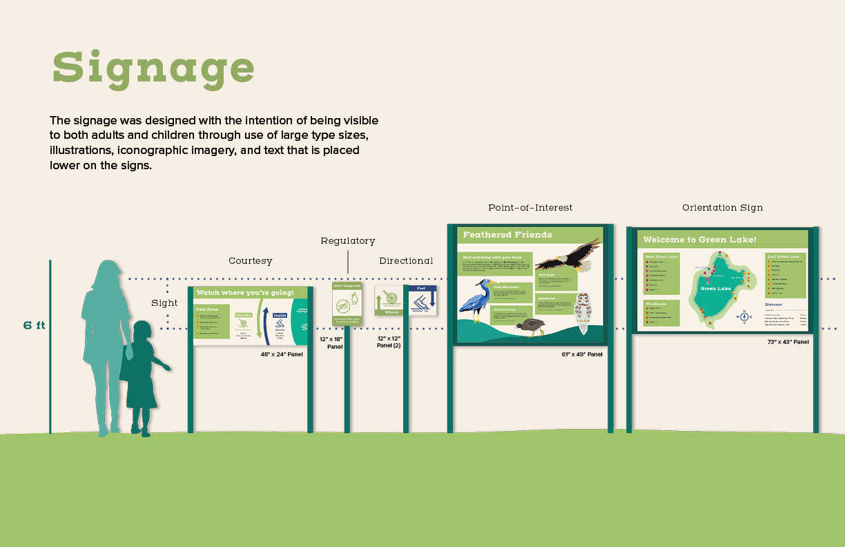
Process:
In designing the system, attention was put on identifying a slab-serif typeface that could be industrious yet friendly to reflect the working-class patron history of the park and its new generation of frequenters. The typeface would also be readable at a variety of distances. Henderson slab reflected those goals, and thus a set of icons showcasing the amenities and activities was modeled after the slabs to form a unified visual system.


As the maps and interest boards began to finish, I worked on regulatory and directionals signs that could be strategically placed in the sight-line of most viewers. These pieces were ideally completed with little to no copy and universally understood.


Outcome:
Through iteration, I found how important it was to design for audience/user ability. While I intended for the wayfinding systems to be interesting to families with young children, I needed to balance what kids might think of as fun, which generally came across as more bright and chaotic, with things that were accessible, that of which can be readable and legible in differing scenarios.
In that regard, the project was a successful redesign, not only in making the park more interactive through bird-finding and placemaking but also with communicating information graphically.